Uncovering UX (Part 1): Elements of User Experience in News & Content Sites

Earlier this year, Google announced that “page experience” is now a ranking signal for search results. This means that the practice of user experience, or UX, is paramount to an effective SEO strategy. For news and content sites specifically, it’s crucial to create a frictionless experience for your readers in order to grab and maintain their attention.
Uncovering Google’s guide to UX design
Late last year, several UX Playbooks from Google were leaked. These outlined best practices for optimizing user experience across several different industries; including finance, lead gen, retail, real estate, travel, auto, and news sites.
For each recommendation, Google calls out how easy it will be to implement, the level of impact, and the key metric the recommendation is targeting.
In part one of our “Uncovering UX” series, we’ll walk through how news and content sites can capitalize on Google’s UX tips, rank higher, and create a mobile site that users love to visit.
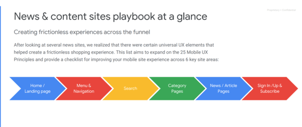
Here are our 6 takeaways from the Google UX Playbook for News and Content Sites:
1. Feature a single top story and remove automatic carousels
The first piece of advice from the playbook is to improve bounce rate by featuring a single top story on the homepage and remove automatic carousels. According to Google, this suggestion has a relatively easy implementation, but high impact. Users frequently scroll past carousels and only click through the first frame of the carousel anyway.
2. Clean up the top navigation
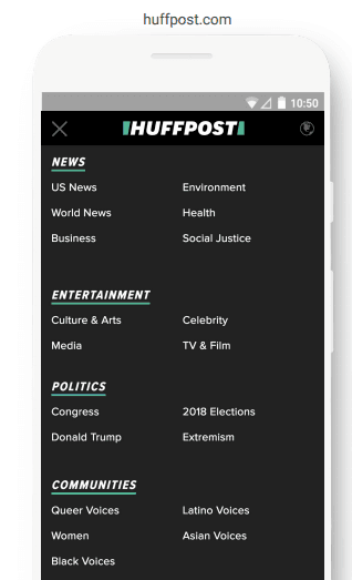
Secondly, to improve page views, Google recommends consolidating your top navigation menu to be less than 1/5 of the page, particularly on mobile. This recommendation has a medium ease of implementation but a high impact. Additionally, expanded menus should be organized by section or categories.
If your site is very dense with many categories, consider adding a secondary menu for less important content, so as not to overwhelm the user.
3. Offer a clear search function
The third suggestion from Google is to include a search function that is visible and prominent at the top of the page. This recommendation is hard to implement but will have a high impact on the percentage of traffic with searches, and conversion ratio. Users tend to look first towards the upper-right corner for search. When search is hidden behind menus or icons, it tends to be less noticeable.
4. Display the content category at the top of pages
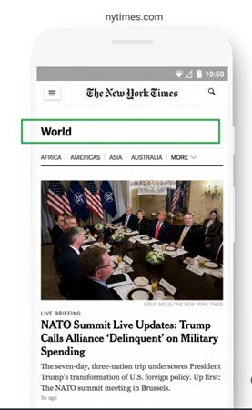
Another recommendation from Google is to make sure there is a clear category title at the top of the page. This helps users differentiate where they are among your different content category pages. Having a consistent and clear category title is an easy implementation and will have a high impact on improving time on site and bounce rate. Google also recommends highlighting the top story related to the category.
5. Add social share options to articles
In order to improve CTR and referral traffic to your blog, Google suggests adding social share options at the top of article pages, so users can easily share content on their social networks. This is a high-impact, easy recommendation to implement.
6. Enable one tap sign-in and sign-up
By enabling one tap sign-up and sign-in, you can streamline the conversion flow for the user. This lets them complete the process in fewer steps and reduces the need for typing, a key element for mobile users. This will also enable instant personalization upon load, and is supported on all major browsers.
Utilizing principles of UX design
When it comes down to it, you want to create a website that users enjoy visiting. Ideally, your audience wouldn’t spend any energy figuring out how to navigate a site, either on desktop or mobile. By implementing these tips, you’ll accomplish that seamless feeling and add immense value to your site.
—
If you want to improve your site’s ranking and usability but aren’t sure where to start, it may be time to contact the experts. Request an audit from the Perfect Search Team today!
Hooked on UX? Download our free resource on the 3 Ways to Boost Your Website’s UX!

Stephanie Castillo is a true Wisconsinite at heart. She’s from Milwaukee (#BrewCrewForLife), attended the University of Wisconsin – Madison, and loves anything with cheese. She was also a competitive Irish dancer for 10 years.


